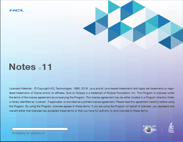
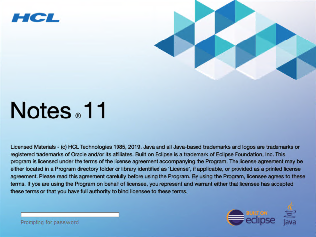
With version 11 of HCL Notes & Domino we also got a new splash screen. To be honest, I think the new screen is butt ugly. The gradient isn’t a proper gradient, and the logos are low quality.

Here is a redesigned splash screen. I have used Krita do create the gradient. In fact there are two gradient on 2 layers. The rest is plain text and some transparent images.

To activate the screen, download the image from here and unzip the archive to a destination of your choice.
Next add the following lines to your client notes.ini file.
HasNotesOverlay=1
SESPlashPath=<path-to-bmp>
Now restart your client. You should now see the new design.
Better looking graphic for sure. To make everything the same as the original, there’s a few things:
There’s a “registered” symbol between “Notes” and “11” in the original, the symbol is a “copyright” symbol in yours.
It’s “Eclipse Foundation, Inc.” in the original – you don’t have the comma in yours.
The original says “The license agreement may be…” and yours says “must be…”
The original says “located in a program directory” and yours says “located in the program directory”. (I think yours is more correct in this instance, but I think it should match the original).
The original has a comma after “if applicable”
Thanks, Matt. I have fixed the issues.
Is it only in Notes 11 you can do this?
No, it is not limited or new to V11. You can modify the splash screen in other versions too. https://www.eknori.de/2015-09-12/how-to-create-your-own-ibm-notes-splash-screen/