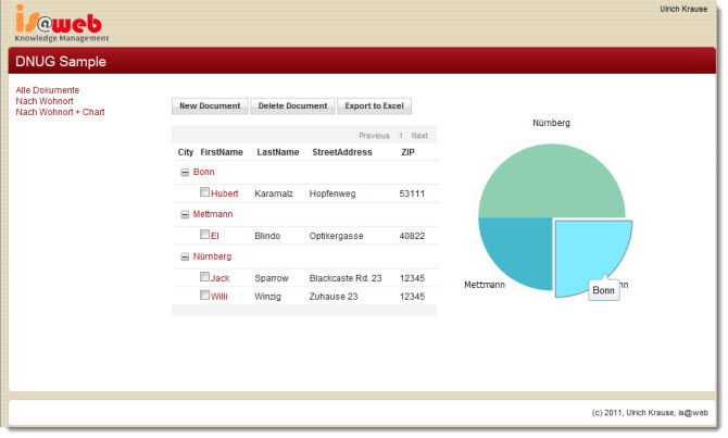
Here is the sample application, I used at my Special Interest Group session at DNUG 2011 in Bonn.
The sample shows a very simple XPage application that you can use to learn the very basics of XPages development. The sample includes:
- catogorized views ( with custom expand/collapse indicators)
- Export to Excel
- Dojo charting for data visualization
Screenshot

Cool. Will you be making the template/slides available as a resource to the community?
Dn’t know exactly what you mean. The template is for downoad in this article and the slides are here https://www.eknori.de/2011-05-19/dnug-2011-arbeitskreis-anwendungsentwicklung/
As they are public avalable they are also available to the community.:-)
about the pie chart: the toolbar repeats the text which already displayed. how do you place the percentage in there?
@Patrick:
Insert a new column into the ByCity view after the first column. Properties: Total, Percentage of all documents, hide details
in the view_chart custom control add the tooltip part to the code.
“{y: ” + rowData.getDescendantCount() + “, text: \””
+ rowData.getColumnValue(“City”) + “\”, tooltip: \””
+ rowData.getColumnValue(“percent”)*100 + “%”+ “\”}, \n”
}else{
“”;